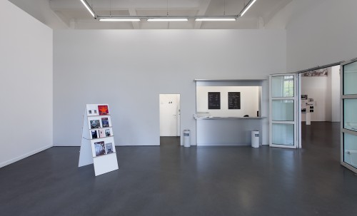
- Gefängnismuseum Hamburg
- Year: 2019
- together with Julian Bühler
- Behörde für Justiz und Verbraucherschutz Hamburg
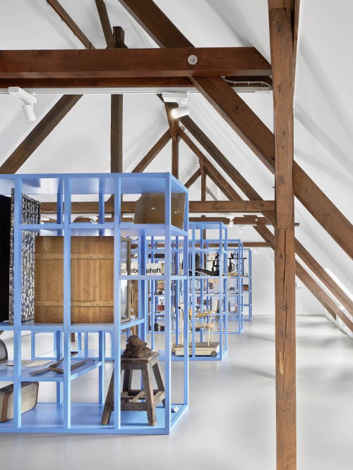
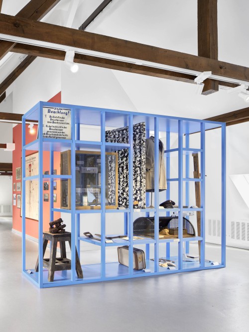
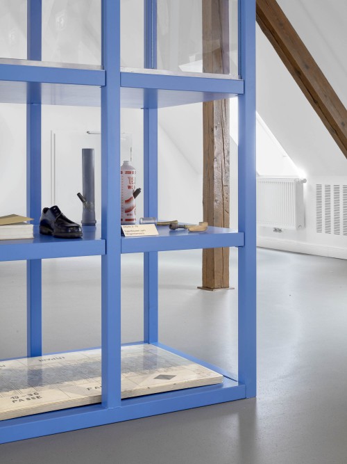
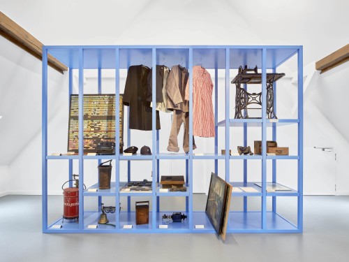
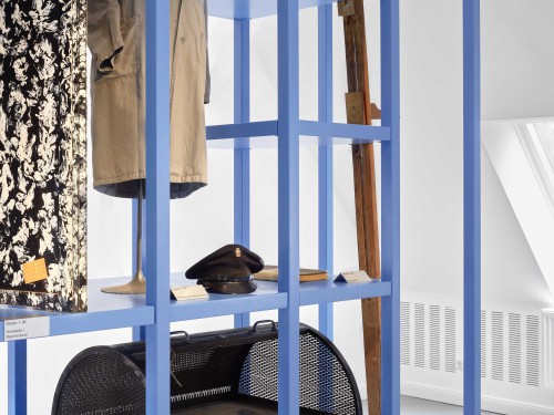
The Prison Museum of the City of Hamburg shows historical, curious, creative and everyday objects from the cosmos of the penal system. Most of the exhibits are based on the collection of a former prison officer.
The exhibition shows a reduced and curated selection of objects, which can be changed or extended continuously.
The concept of the exhibition as well as the exhibition architecture are based on the presentation form of the guided tour. Under the guidance of Klaus Neuenhüsges, groups of up to twelve people are given an insight into the past and present of law enforcement in Hamburg. The focus is on a presentation of the entire collection that is as neutral and non-judgmental as possible. In this sense, the exhibition is not intended to present an improvement of the penal system, but rather to give visitors the opportunity to question historical and current developments.
The exhibition is to be understood as an open archive, which holds different documents and stories. Through the interests of the visitors, each tour will be individual and the emphasis in the room will be newly set.
Awarded: DDC Winner 2019 Bronze
Pictures by Edward Greiner
- DAZN DECODED
- Year: 2021
- Client: DAZN Limited
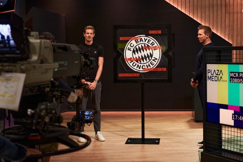
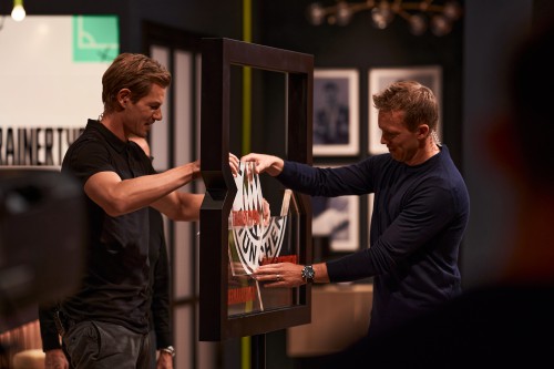
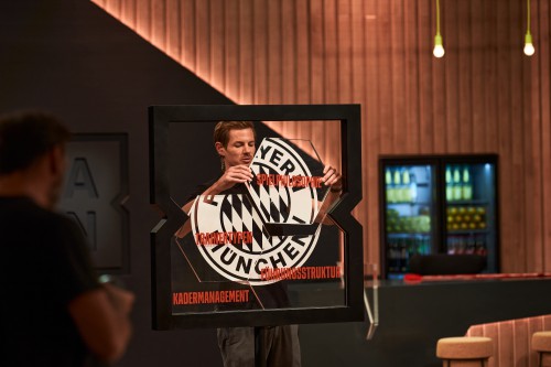
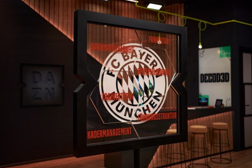
In the new broadcast format DECODED of sports streaming service DAZN, experts like Ralf Rangnick and Sami Khedira decode concepts and strategies of various top European clubs. Over the course of the broadcast, the club mosaic is assembled in a central object. The six building blocks make up the club's entirety, both visually and substantial.
- Azurer Collection Store
- Year: 2016
- together with Julian Bühler
- Client: Azurer International Trade GmbH
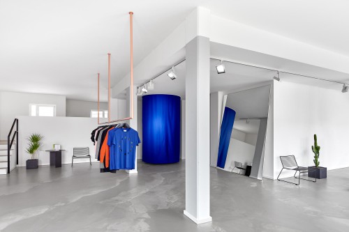
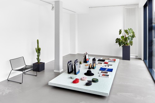
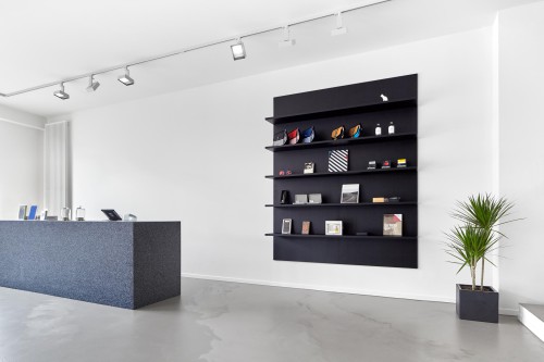
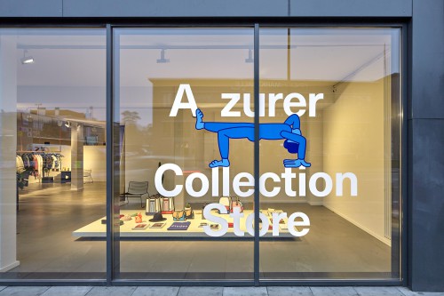
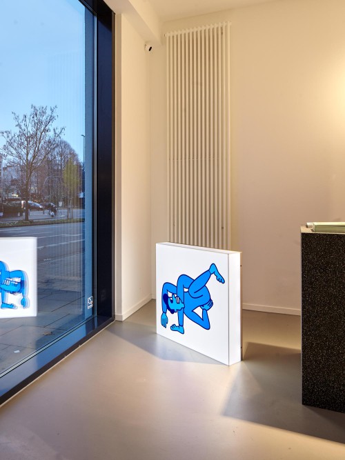
The Azurer Store at Neuer Kamp in Hamburg presents unusual clothing and products from all over the world. Above all, the concept works against the ordinary.
The design of the interior follows this strategy and is limited to the essential and necessary basic elements of a fashion store. Thus, the store consists of only six upscaled objects: A sales lane, a dressing room, a mirror, a clothes rail, a display and a shelf.
Pictures by Edward Greiner
- STERN Preis
- Year: 2022
- Client: Gruner + Jahr Deutschland GmbH
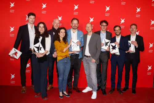
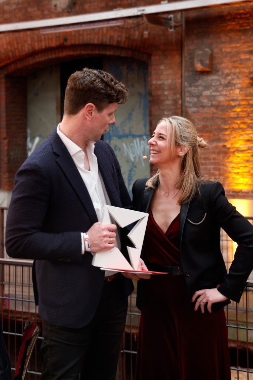
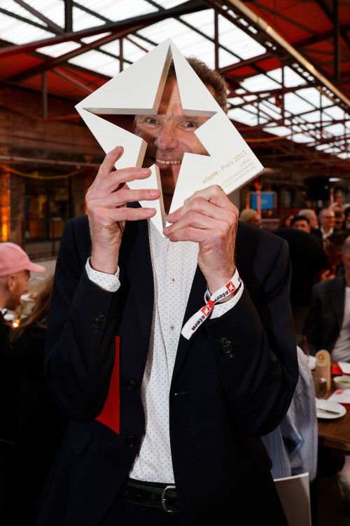
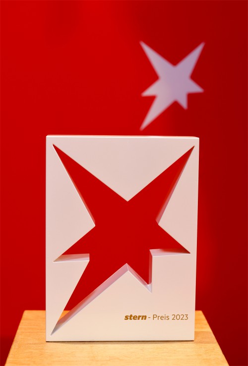
The Stern Preis (formerly the Henri Nannen Preis) was first awarded in 2022. With its simple design, the trophy can be ideally staged for media purposes and immediately encourages interaction.
Pictures by Franziska Krug
- Wasserschloss Quilow
- Year: 2019
- togehter with Gruppe Praxis
- Client: Förderverein Stiftung Kulturerbe im ländlichen Raum MV
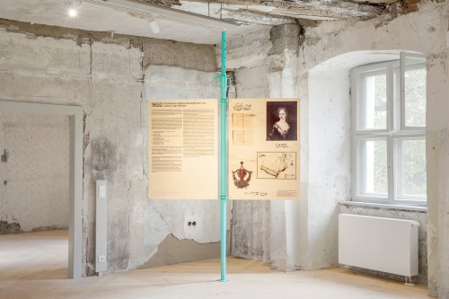
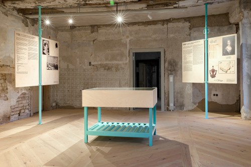
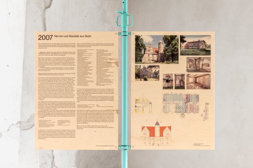
"If these walls could speak..." is often said, and the walls of the Quilow moated castle have a lot to tell. One can see the building's more than 400-year history, the numerous conversions and alterations. Taking the "transparent preservation of monuments" seriously, the concept of the exhibition design also treats the rooms of the castle as what they are - living places that neither want to be ignored nor concealed. The main element of the exhibition design are ceiling props. Due to their color scheme, they almost completely escape their origins. Nevertheless, they are always a small reference to the breaks and reconstructions in the history of the castle. As a classic building site object, they blend into the rooms and yet, through their untypical pastel color, manage to emphasize the exhibition within them. The vertical, slender struts adapt to the conditions in the rooms to be played. They are the supports for text and picture panels as well as display cases. These are made of directly printed birch multiplex panels and give the clear layout, through this warm, natural materiality a perfect counterpart.
Pictures by Julian Mader
- Kunsthaus Hamburg
- Year: 2014
- together with Frieder Bohaumilitzky, Henk Müller, Nils Reinke-Dieker and Larissa Starke.
- Client: Kunsthaus Hamburg
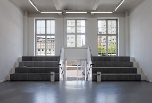
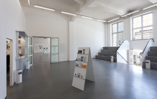
What are the possibilities of the foyer of a public cultural institution?which functions of the Kunsthaus and which needs of other actors can be offered space in this transition zone?the redesign divides the foyer into three areas. These can be described with the keywords supply, stay and free space. At the front of the foyer, space was created for the practical facilities by moving in a wall. Behind it is the checkroom, storage space and the sales counter, which serves as an information area, cash desk and bar. Its unglazed opening to the foyer makes it resemble a kiosk - a playful expression of its function. On the opposite side of the foyer, a two-part grandstand was created to the left and right of the entrance stairs. This structure provides pleasantly informal seating for many people, both in everyday life and at events. From the top step, the view can be directed both into the interior and to the surroundings of the Kunsthaus. The robust materials of concrete and aluminum, which are otherwise more likely to be found outdoors, also define the foyer as a kind of extension of the public sphere, inviting visitors to linger without making a visit to an exhibition or even other consumer practices a condition.
Pictures by Hayo Heye
